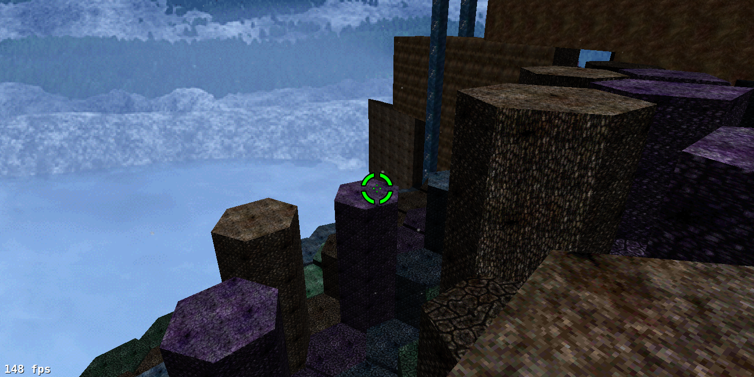
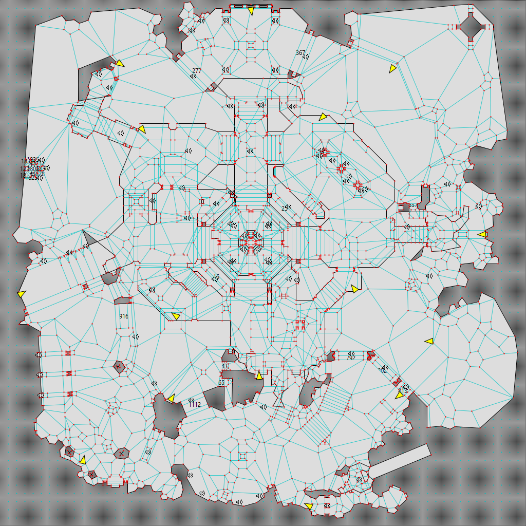
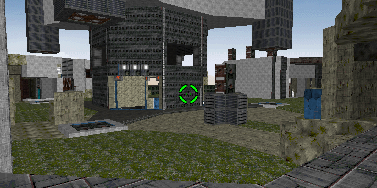
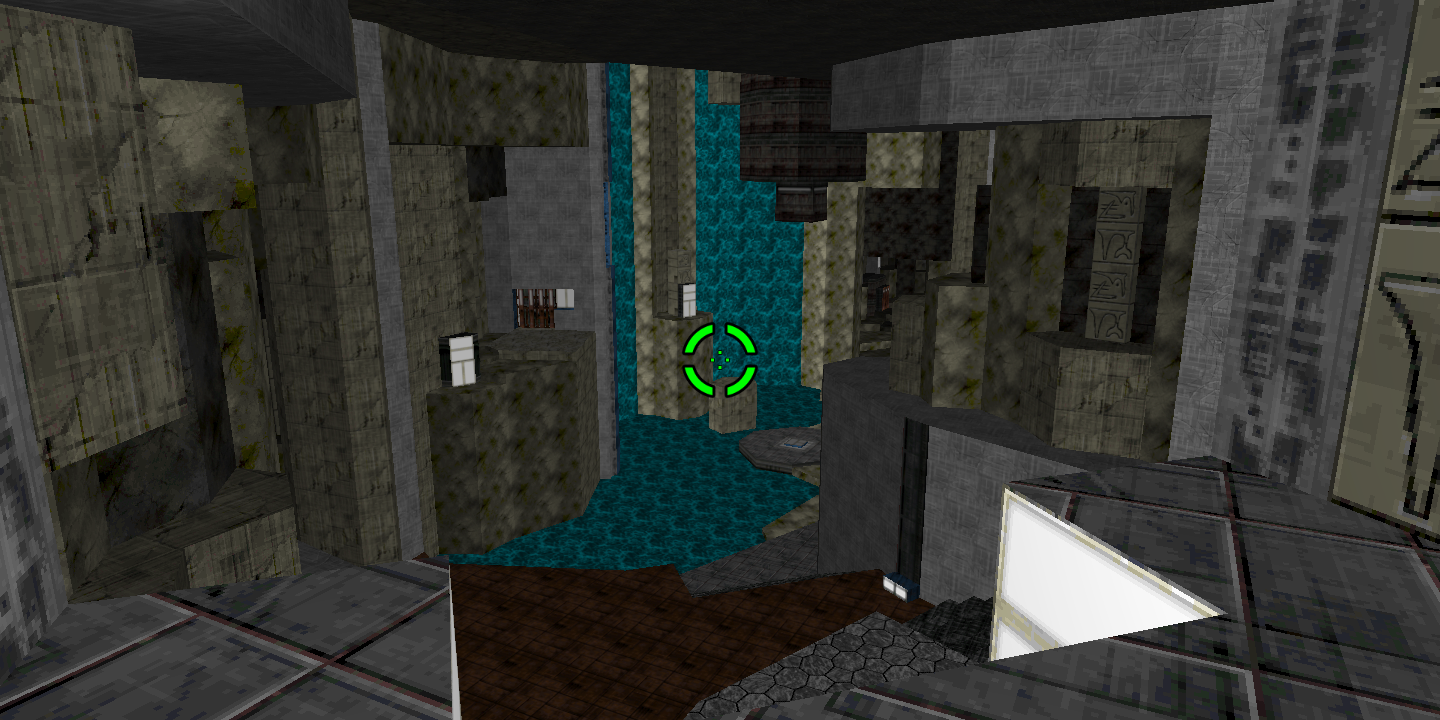
I mentioned in the advanced page’s General Notes section that map indices are the primary limit on map complexity and advised avoiding too many small polygons in a given area. Two more reasons to avoid too much complexity, though, are to avoid frustration and to improve map performance. This case study largely centers on the once-infamous Eternal level ‘Where Giants Have Fallen’. I apologize in advance for the length and number of images; the main lessons can be summarized as ‘Don’t overuse greeble or sound objects,’ but I think illustrating what that means would be helpful.
Contents
- Intro
- Table of Contents (you’re looking at it)
- Three Iterations of ‘Where Giants Have Fallen’
- ‘Il grande silenzio’ (Tempus Irae Redux)
- ‘Monument to All Your Sins’ (Starlight)
- ‘Stone Temple Pilates’ (Marathon Phoenix)
- Lessons
- Endnotes
Three Iterations of ‘Where Giants Have Fallen’
Iteration 1 (Eternal Mark V)
Designer: Forrest Cameranesi
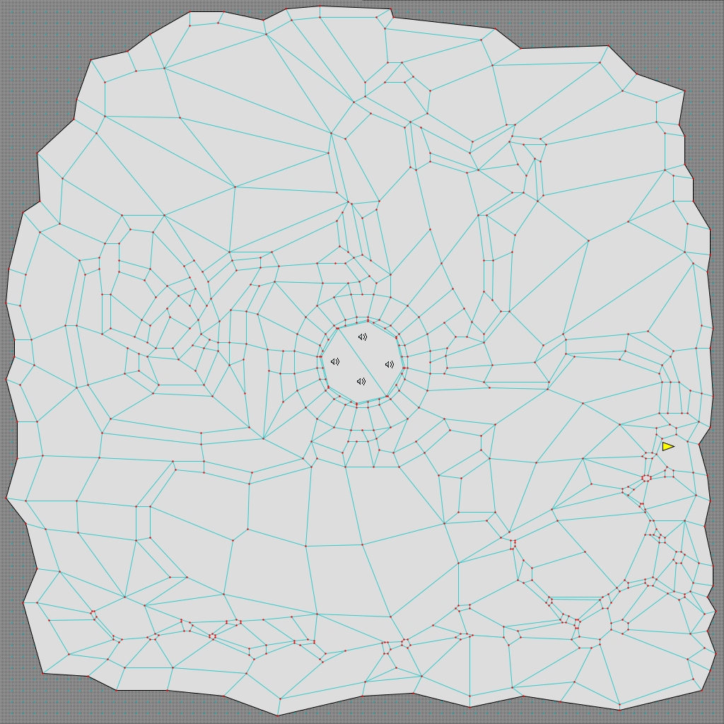
This is a Weland view of Eternal Mark V’s ‘Where Giants Have Fallen’:
(I’ve hidden all objects besides players and sounds in all these screenshots; they’re the only important objects for our purposes. I’ve also removed extraneous lines and map writing from some later screenshots; the writing would be illegible at this resolution anyway. Also, click this or any subsequent image on this page to enlarge it.)
And here are some Vasara screenshots, with a few major caveats. First, I took these screenshots with 1.3 shapes because I wanted consistency between them. Second, the map had basically no shading to speak of, so I ran Auto Shade on it to make it easier to parse. Third, I rarely use hi-res textures when texturing, due partly to loading times, but mostly to memory usage: the game must load all textures into memory when it loads VAF, Vasara, or Visual Mode.lua. That adds up fast. That said, the Mark V version looks like this:
Beyond the obvious issues of the terrible shading and the sea of gray, this version, despite featuring only 509 polygons, is relatively slow for several reasons I’ll discuss at length soon.
Iteration 2 (Eternal X 1.0)
Designer: Adam Ashwell
Eternal X 1.0 overhauled the level, but the new version was even slower. It looked like this in Weland:
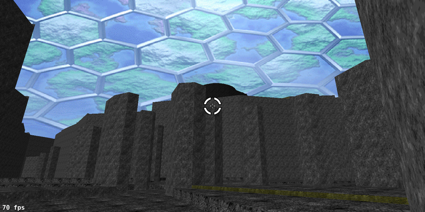
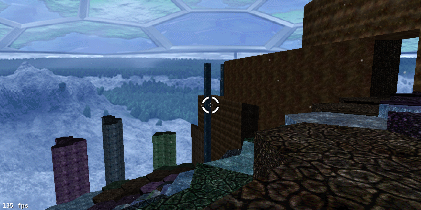
Despite only featuring 836 polygons, this one chugs even worse. Both of these maps have a major problem: they have essentially no negative space. To oversimplify slightly, Aleph One is effectively a portal engine. Portal engines have several strengths, but rendering large, complex outdoor spaces is not one of them. As a result, whenever players approach the edges of one of these maps and look inward, the performance plummets, even on modern boxes. With frame interpolation being an established Aleph One feature, it’s simply unacceptable for maps to get fewer than 60 fps on modern boxes, at least in areas of the map players are meant to access. Here are a few screenshots of “Where Giants Have Fallen” in Eternal X 1.0.3 (again with 1.3 textures):
You get as close to the feeling of having climbed up a huge mountain as Aleph One is likely to provide (which is admittedly not very close), but as you can see in the first screenshot, the frame rate is bad in places, the texturing is monotonous, and the lamps just look silly. Subsequent releases fixed the latter two aspects, but the frame rate problem persisted, which was the primary impetus for CryoS and me to remake it from scratch.
Iteration 3 (Eternal X 1.3)
Designers: CryoS and Aaron Freed
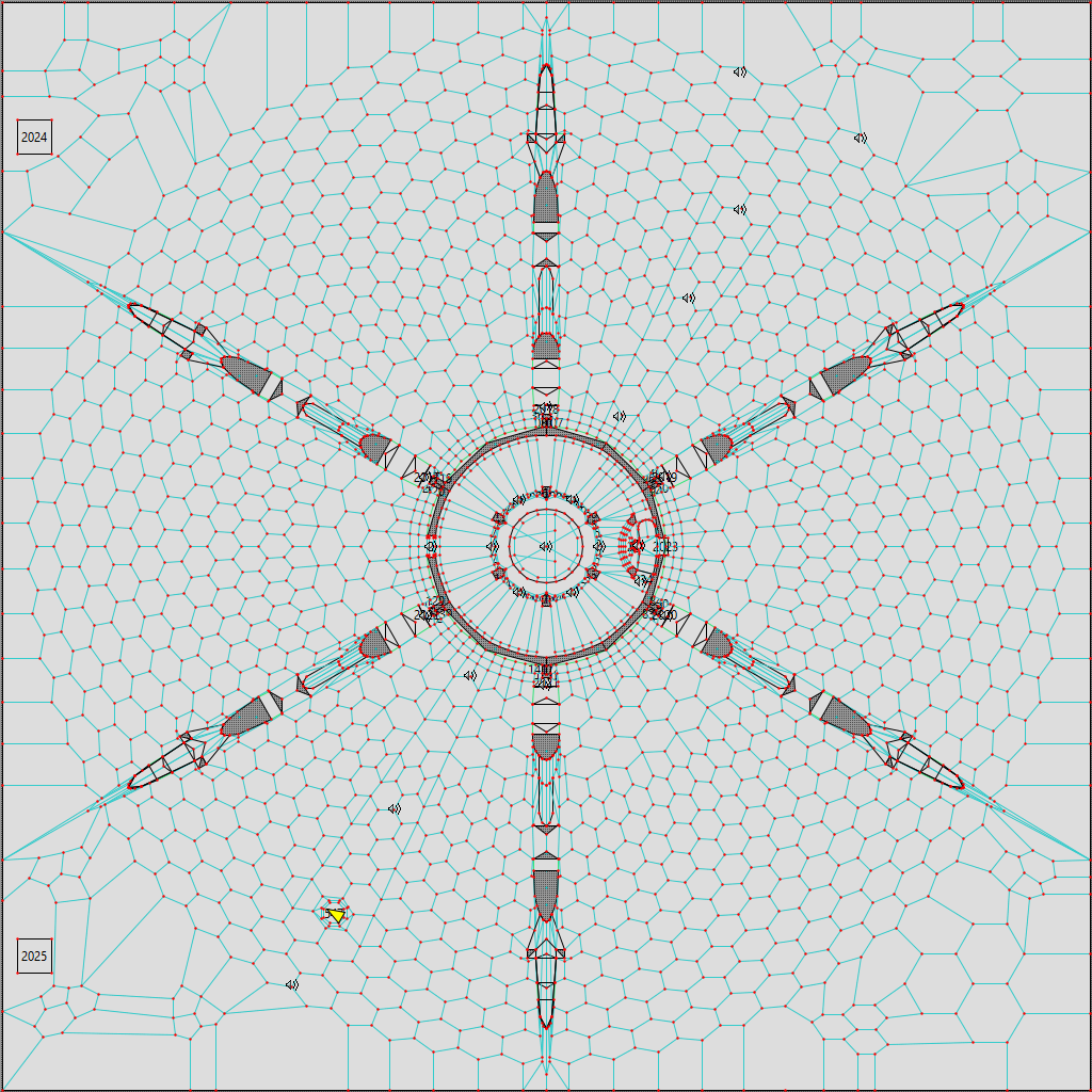
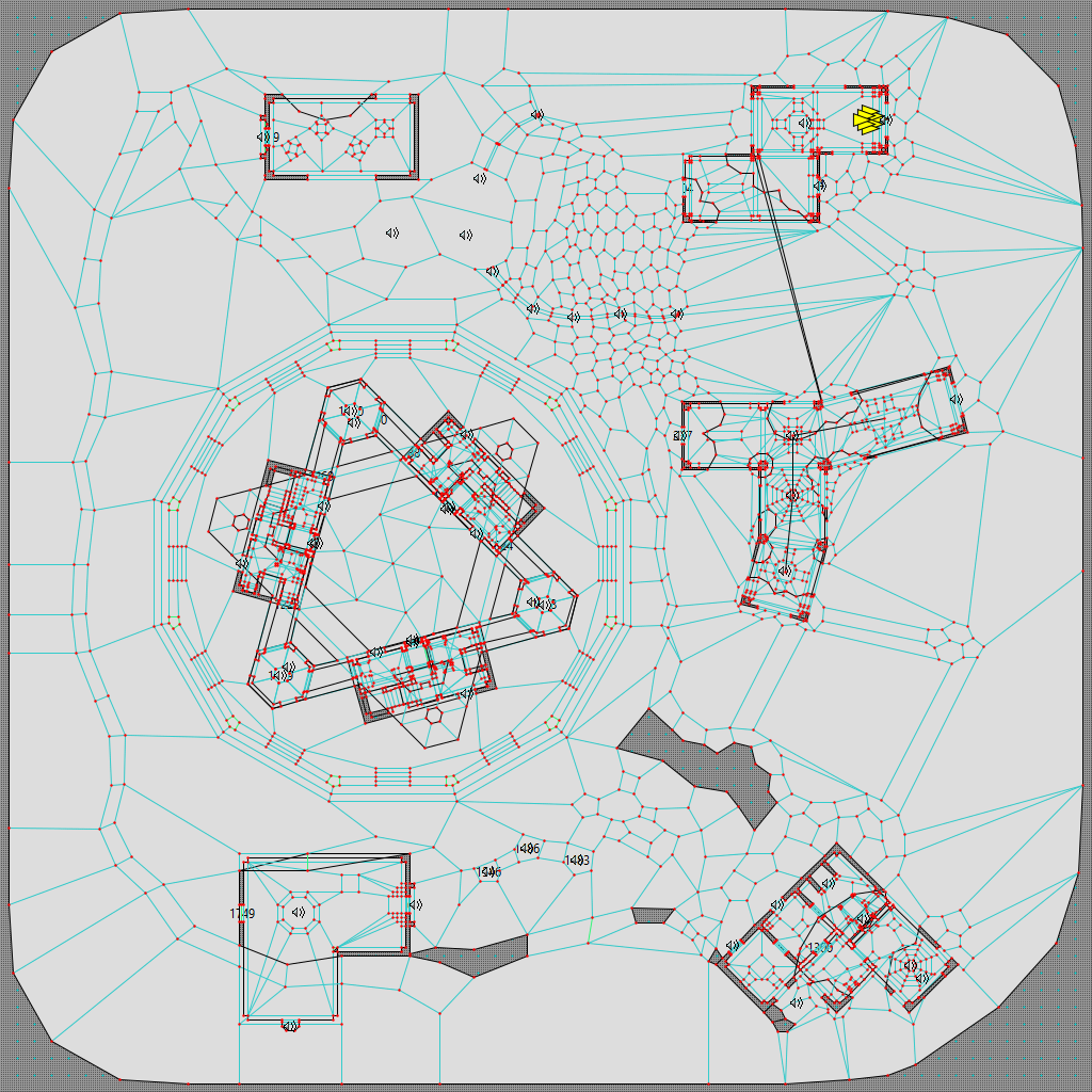
Our new version – and I’ll withhold its polygon count for a moment – looks like this in Weland (minus some map writing that I’ve removed to make the screenshot more legible):
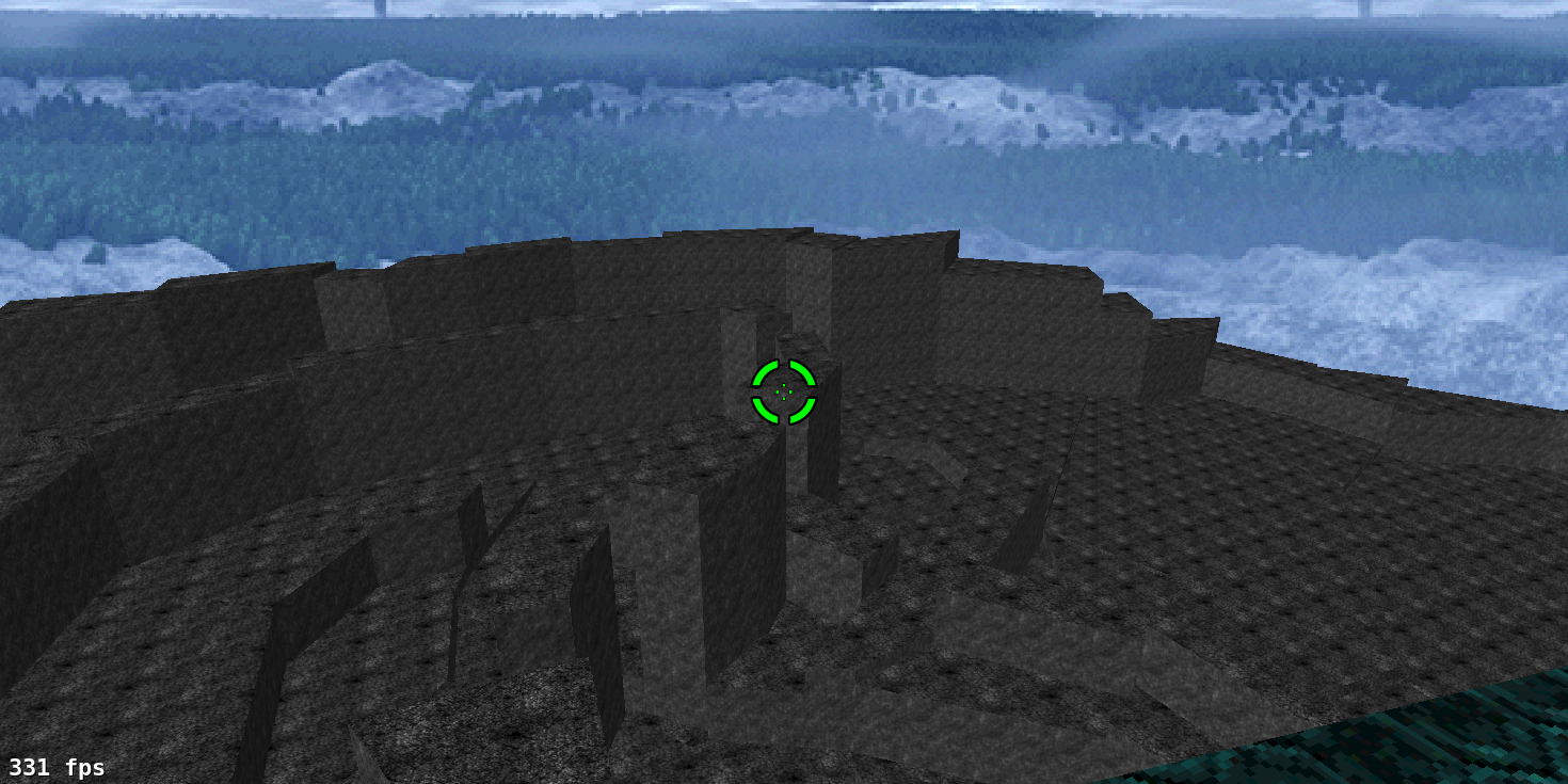
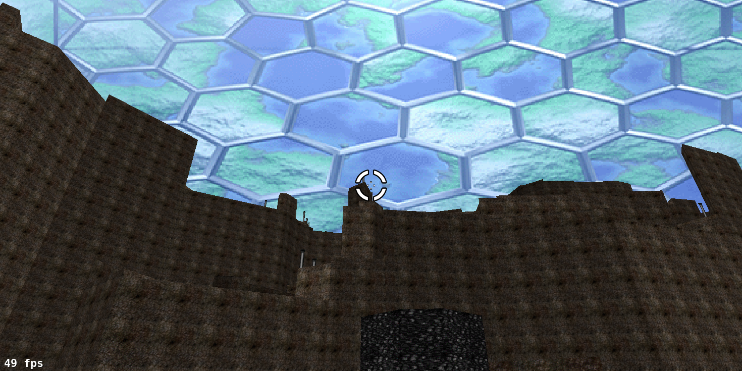
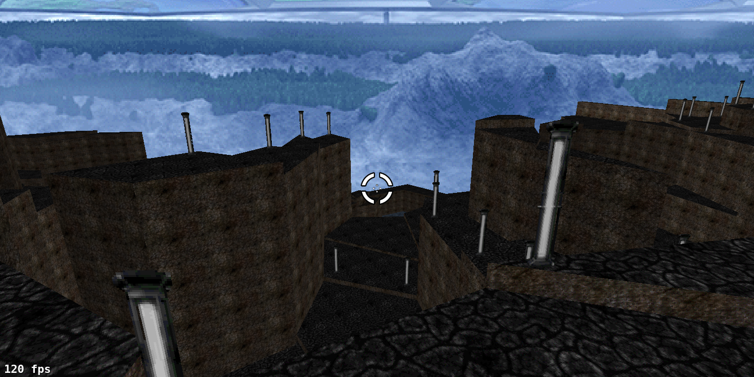
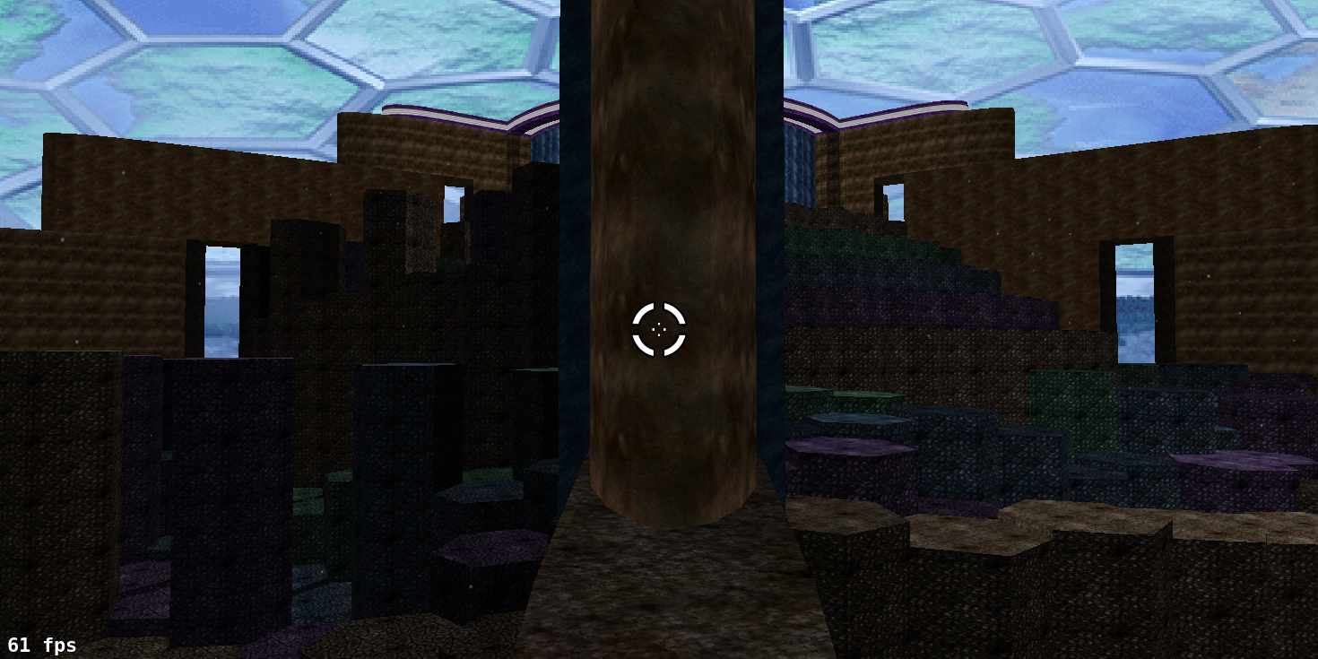
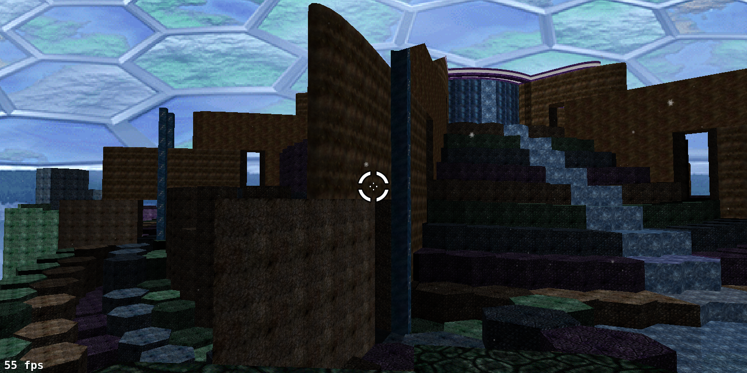
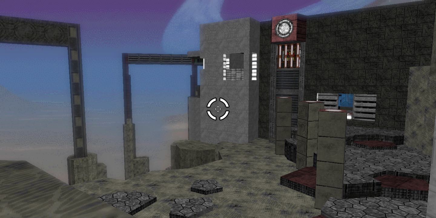
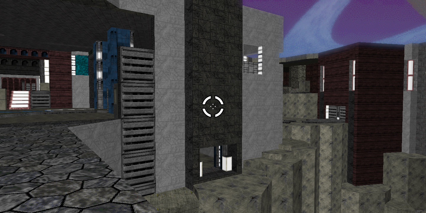
This screenshot has some conspicuous features. First, the new map is a lot more circular. (I worked on the design, to the surprise of no one who knows my style.) Secondly, there are crossbeams extending through playable areas of the map that break it up into sextants (septants if we count the central structure). It’s hard to tell from a Weland screenshot, but these actually create an optical illusion to make players think they’re seeing much further than they actually are; landscape textures mostly conceal players’ inability to actually see past the crossbeams. Here are some screenshots I took in Vasara:
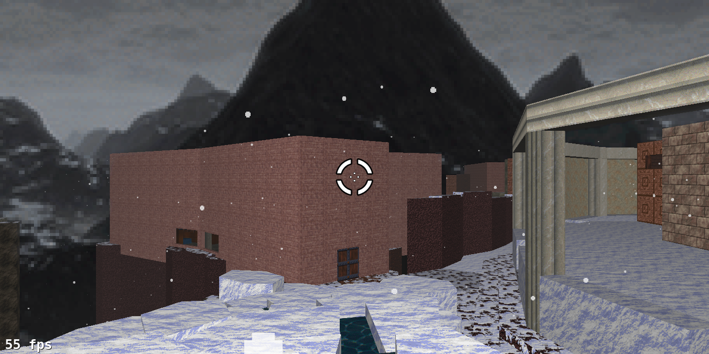
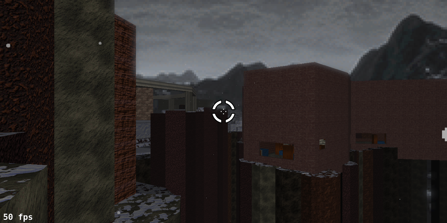
Again, we notice a few things immediately. First, this area still looks wide-open, even though it constricts the view to a much smaller area; second, despite having a snow script (which can be a drag on performance), the map gets a much better frame rate. And here’s where I’ll note its polygon count: 2,028. That’s not a typo.
Crossbeams: A Closer Look
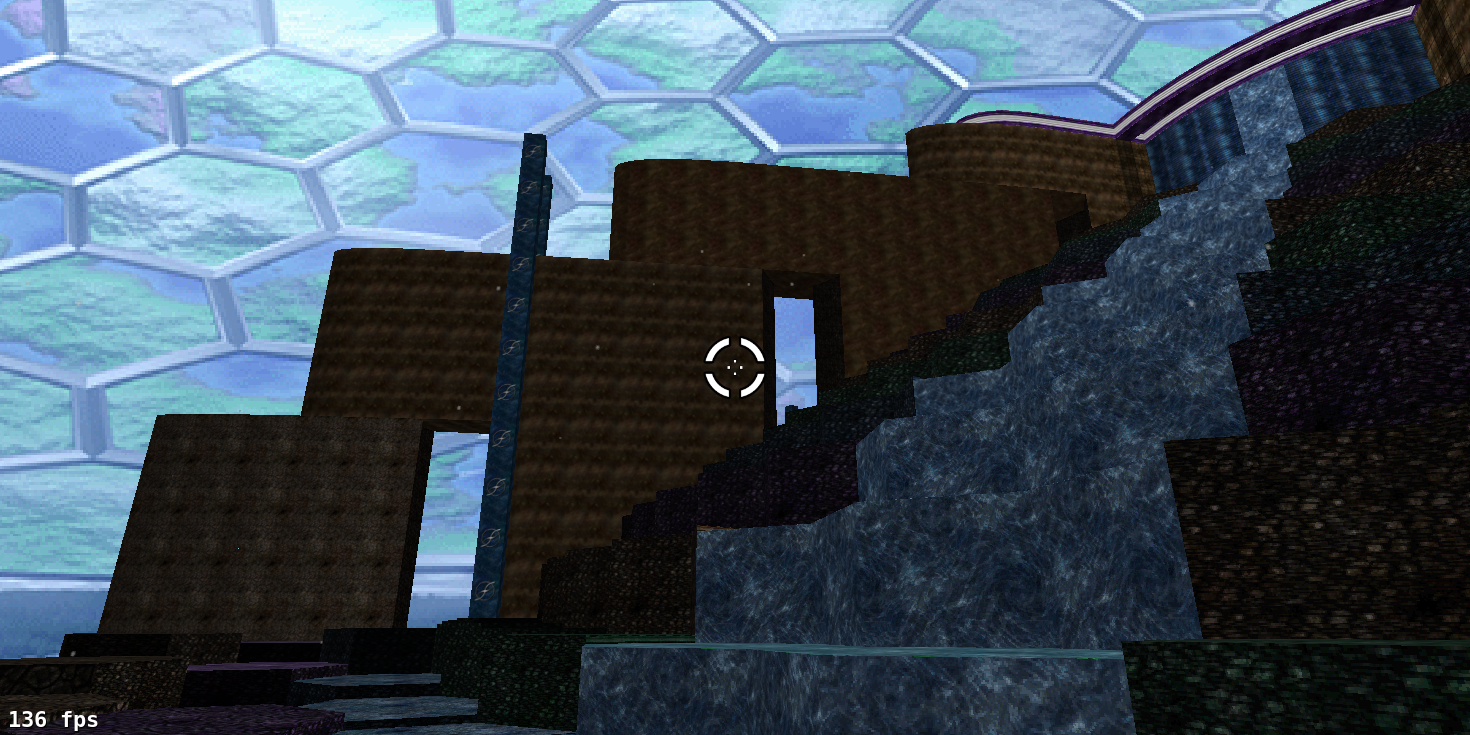
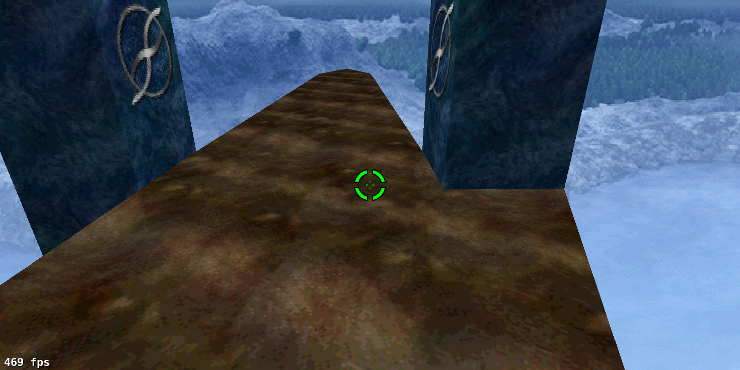
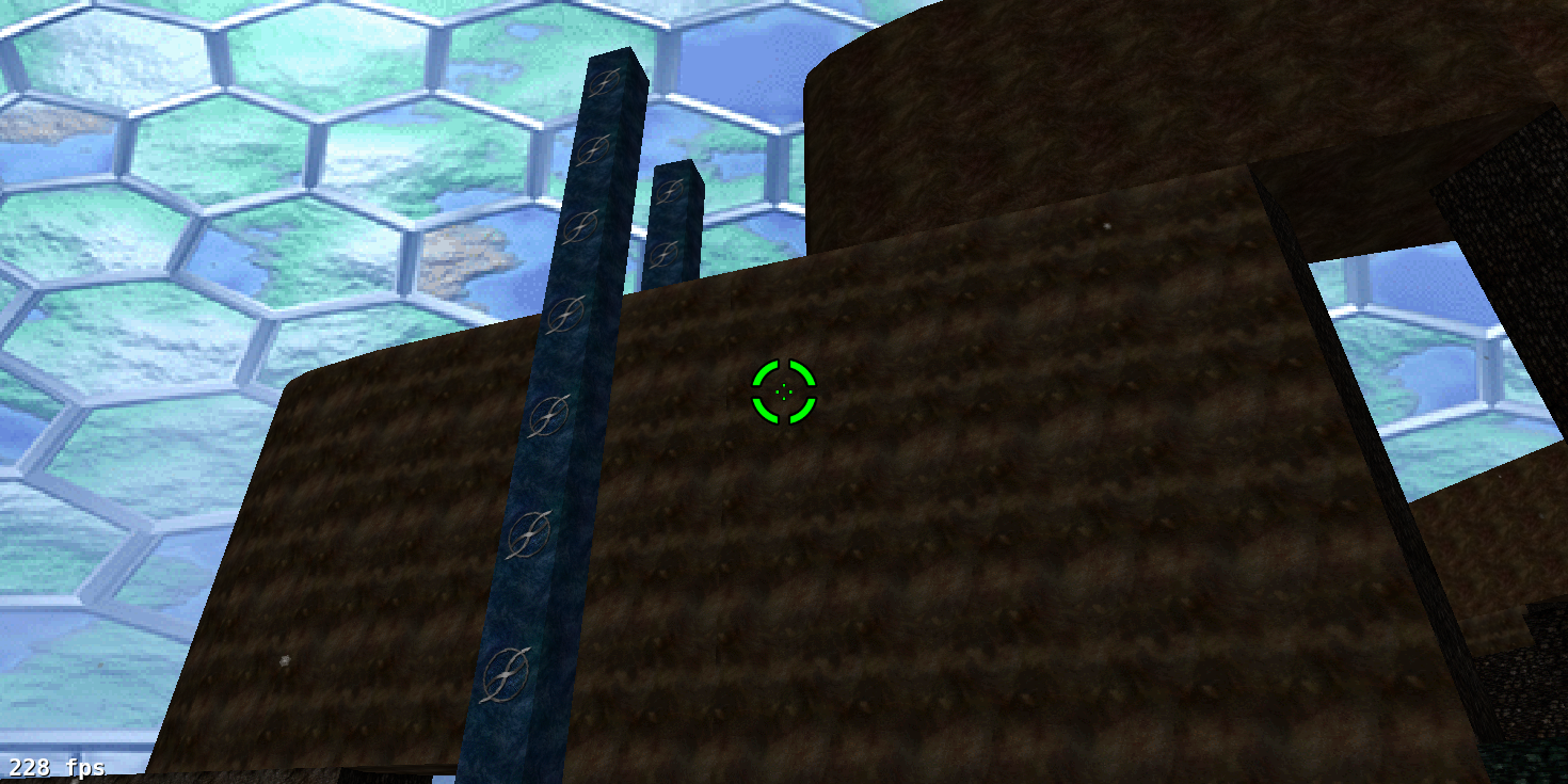
But doesn’t it look like you can see over the crossbeams? Yes. This trick illusion employs ‘5D space’, the engine’s ability to overlap spaces in X/Y/Z coordinates. It can do this because it uses four dimensions to render spaces: X, Y, Z, and polygon. This is related to it being a portal engine: it determines what to render based on how lines connect polygons. I feel a bit like a magician revealing how to perform a trick an illusion here, but… if you could get to the area of the crossbeam with the blue pillars, you’d see this:
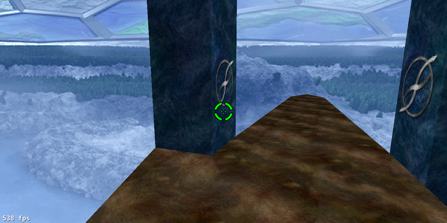
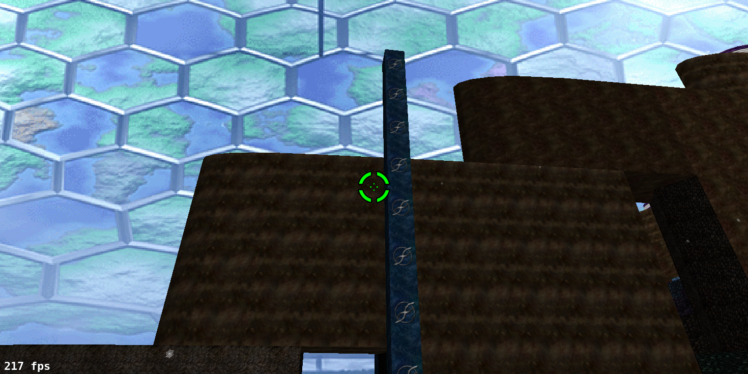
And the other side of the crossbeam would look like this:
The only thing to the left of the last screenshot, and to the right of the one prior, is a landscape-textured wall. (These regions are, of course, inaccessible to players.) As long as we constrict players’ view to a reasonable segment of the level, the frame rate rarely dips below 120 fps and almost never below 60 (on my eight-year-old Windows box, no less).
Escape Will Make Me God
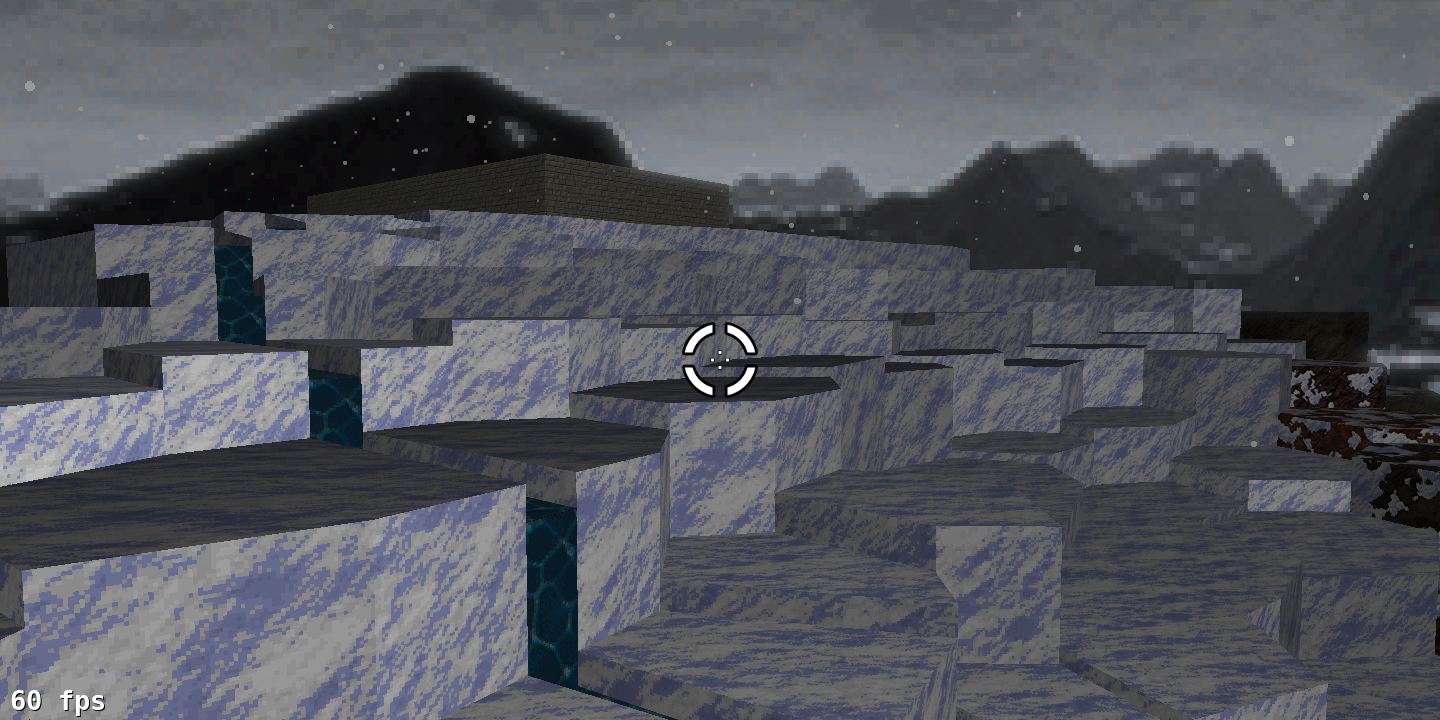
But in a few cases, players can actually escape the constriction. One is if they fall to their deaths, which, who cares. In a few others, though, they can use the assault rifle (or a similar weapon) to boost themselves over onto the edges of the crossbeams, whence they’ll get a clear view of two sextants at once:
Or even jump to an island, where they can see the sky texture clipping their view of the crossbeam in places:
I consider these secrets, so I don’t really care to fix them. More importantly, this goes to show how important negative space is to keeping the frame rate within acceptable bounds.
The Magic Disappearing Pillar
There are other seams in the level design as well, but there’s usually enough going on in the level to distract players from noticing. Another case relates to the blue pillars. Two are clearly visible from here:
However, if we step a bit to the left:
The rear one disappears. This is a result of the engine’s lack of any sort of ‘bridges and balconies’, owing to how it connects polygons. We can’t stack one polygon on top of another, and the passage under the crossbeam blocks off the view above it, so the blue pillar in the back is impossible to show. Despite this, I felt the blue pillars were worth including, since they conceal more conspicuous blemishes in the view from the top of the level (which are again consequences of the passages beneath the crossbeams).
How We Stayed Within the Index Limits
This is the largest map I’ve constructed (mostly) from scratch that never once exceeded the map index limit. There are a few reasons for this, but I think the two biggest are ambient sounds and greeble.
i. Minimal Greeble Density
Greeble, in this case, refers to map detailing. This may not be evident to anyone else but me, but the newest ‘Where Giants Have Fallen’ was effectively my second attempt to make a pastiche of Phoenix’s ‘Stone Temple Pilates’, in this case combining its style with those of Apotheosis X (hence all the hexagons, though I already felt obligated to use them due to Tacticus’ brilliant sky texture), Eternal itself, and of course my own compulsion to make everything as circular as possible. (Ironically, the one part I didn’t create from scratch is the central structure, the most circular part of the whole level – that was CryoS’ work.)
Overall, outside the centre of the map, the average polygon size is really quite large; polygons sometimes get narrow, but their sides generally remain quite long. There are multiple advantages to this beyond just preventing extra map indices from being gobbled up by polygon exclusion zones – for one thing, as Hastur’s Workshop explains, a monster cannot cross a line that’s shorter than its diameter, and if the monster gets trapped in a polygon where all lines are shorter than its diameter, it will be unable to move or attack unless a player occupies the same polygon. Furthermore, keeping polygons relatively large makes sound objects less costly to use. Speaking of which…
ii. The Law of Conservation of Sound Objects
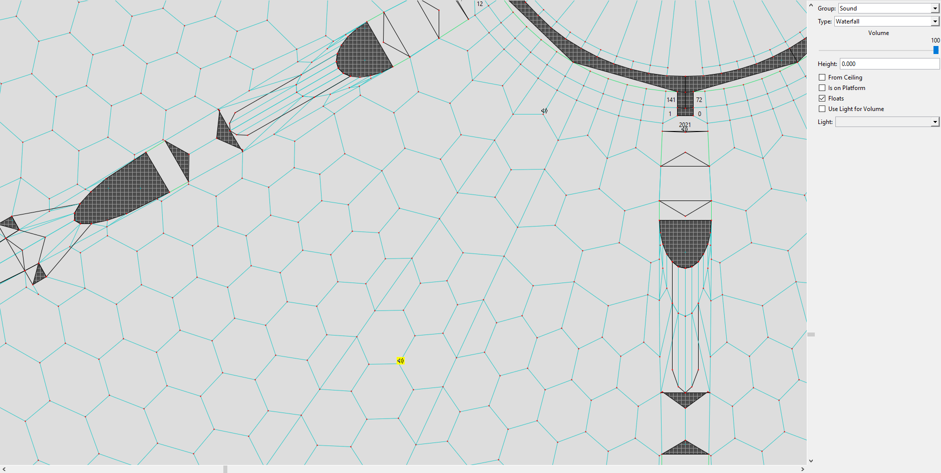
The other way I saved a lot of headache was by using as few sound objects as possible; to avoid using too many, I even went to the trouble of making new ambient sounds that combined existing sounds. For instance, this sound may say ‘Waterfall’:
However, the following script is merged in with the level:
<marathon>
	<!-- puts Water & Waterfall into the Waterfall slot -->
	<sounds>
		<ambient index="6" sound="251"/>
	</sounds>
	<!-- sets Water to use the Waterfall sound slot -->
	<liquid index="0">
		<sound type="5" which="6"/>
	</liquid>
</marathon>
As the comments suggest, this reassigns the ‘Waterfall’ ambient sound to use a separate ambient sound created by mix-pasting the ‘Water’ and ‘Waterfall’ sounds; and it plays that sound whenever the player’s head is above water. This effectively cuts in half the number of sounds I need water to play, and cuts the number of sound objects on the level by eight.
On dream versions of the level (of which there are four), I embed another script to combine the ‘Wind’ sound (or, in one case, the ‘Wind & Rain’ sound) and the ‘Dream Ambience’ sound, thus saving further sound objects. The expense is three sound slots and about a dozen megabytes in the sound file (these sounds are CD-quality stereo, so they’re not small), but hey, that’s nothing by the standards of modern games, and it means the map runs without any issues.
‘Il grande silenzio’
Collection: Tempus Irae Redux
Designer: Aaron Freed
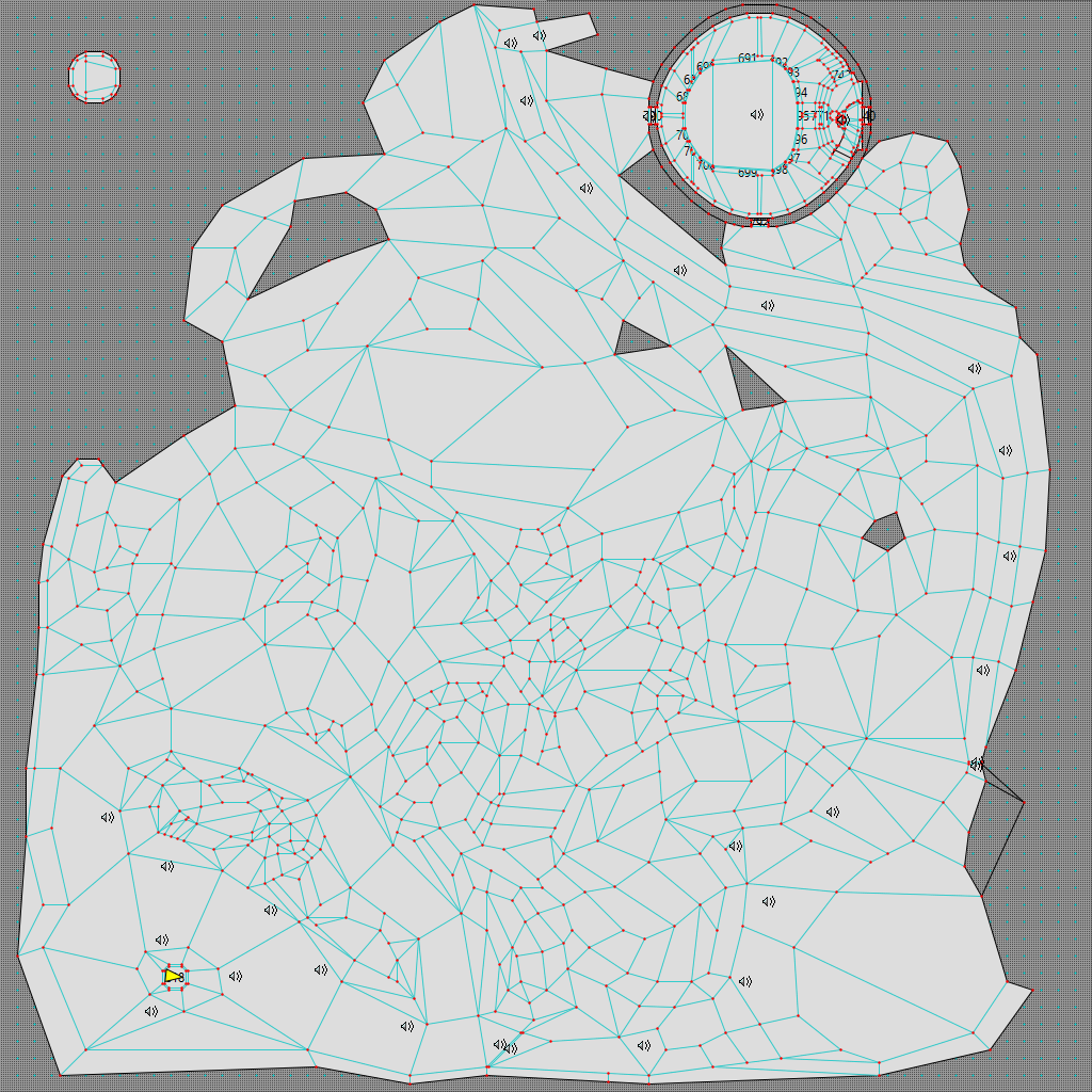
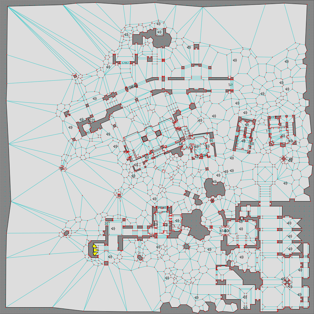
My first pastiche of ‘Stone Temple Pilates’, seen above in a near-final state (1,751 polygons), went a lot differently. Called ‘Il grande silenzio’ (after a brilliant Corbucci spaghetti western with an equally brilliant Morricone soundtrack), it appears in Tempus Irae Redux, which came out in March 2025. There are obvious stylistic differences, starting with the mathematical regularity of ‘Where Giants Have Fallen’; we can also see how much more densely the sound, points, and polygons are clustered in many areas of ‘Il grande silenzio’ (and, as a direct consequence, how much less densely they’re clustered in others).
In fact, I first ran out of map indices at around 1,500 polygons and had to prune dozens of sound objects. This is partly because I set almost all my doors to Heavy S’pht Doors (well, Heavy Italian Doors, as we might call them in Tempus Irae Redux), which each require sound objects to keep their ambient sounds from cutting off; and partly because I was pastiching two brilliant mapmakers: RyokoTK and my co-conspirator James Hastings-Trew, who both tend to employ a lot of greeble. Ryoko noted on Discord that I ‘underestimated just how damn wasteful’ his polygon use is, but funnily enough, I deliberately set out to exceed the amount of greeble they use, reasoning, ‘Modern computers can handle it.’ (This was my first mistake; it was before Aleph One had frame interpolation.) But thanks to the snow script and the comparative lack of negative space, the map chugs in a few places:
I initially wanted to fix that, but I kept procrastinating because I couldn’t face the idea of removing and reconstructing parts of the map from scratch. By the time the project came out, we decided computers had gotten fast enough that performance shouldn’t be an issue. Moral of the story: Sometimes procrastination pays off, kids!
It might be more instructive to show screenshots of these maps consecutively:
Now, do I think the geometry in the Tempus map looks cool? Yes. Do I think it looks that much cooler than the Eternal map? Certainly not enough to justify the added difficulty it caused me.
‘Monument to All Your Sins’
Collection: Starlight
Designer: RyokoTK
That said, I’m showing these screenshots not to show off the maps, but to illustrate how overusing greeble causes problems, and to provide a better yardstick for what ‘overusing greeble’ even means. Greeble looks cool, but you have to know how much is too much. There’s probably no way to truly learn this except through trial and error, but examining mapmakers’ styles more closely than I did can help. Ryoko doesn’t use as much greeble as I thought he did when I made ‘Il grande silenzio’. I believe ‘Monument to All Your Sins’ from Starlight still has the highest polygon count of any map he’s released (1,843):
Yes, there are parts with plenty of greeble, but there’s really nothing approaching the density I was using. Regardless of this, when I got his permission to adapt it for Chronicles as a solo level, he warned me that it was near the map index limit, that he’d had to simplify it during construction, and that it’d probably crash if I added too much complexity or many more ambient sound objects – which, in fact, is exactly what happened. In any case, here are two views from the southeast of ‘Monument’ (which, to be clear, is just about the upper bound of the detail I’d suggest trying to incorporate):
There are parts with a lot of greeble, but others with almost none. And it looks fantastic. This was a lesson I hadn’t absorbed when I made ‘Il grande silenzio’, but ‘Where Giants Have Fallen’ hammered it home for me.
‘Stone Temple Pilates’
Collection: Marathon Phoenix
Designer: RyokoTK
While I’m at it, here’s ‘Stone Temple Pilates’, which has 1,771 polygons. The Weland view looks like this:
I think the map’s overall polygon density is comparable to what I wanted ‘Il grande silenzio’ to have, but there are some important differences. The clusters of small polygons aren’t as densely packed together, and while there are a lot of sound objects, Ryoko has few of them near polygon clusters as dense as mine. (Scroll back to the ‘Il grande silenzio’ Weland screenshot and look at how densely clustered the polygons in some of my houses are – then bear in mind that many have two floors, so they’re even more densely detailed than they look.)
‘Stone Temple Pilates’ looks like this in Vasara:
This map slaps. Its influence on ‘Il grande silenzio’ is probably obvious; its influence on ‘Where Giants Have Fallen’ may be less so, besides the isolated islands whence Enforcers snipe at players, but it’s nonetheless there.
Lessons
We can boil down the lessons of this case study to two major principles:
- Don’t overuse greeble.
- Don’t overuse sound objects.
However, if I just wrote that – or even ‘don’t overuse greeble and sound objects so you don’t run out of map indices’ – you might not grasp what ‘overuse’ means. Hopefully, you at least now have reference points.
An even better understanding can come from looking at Starlight, Phoenix, latest preview build of Eternal, and Tempus Irae Redux yourself. Learning from others is one of the best ways to improve. RyokoTK’s other works (Kindred Spirits, Paradise Lost, Second Quest, etc.) are also well worth looking at, as are the works of mappers like windbreaker (Istoria, Imperium, Infra Apogee, Caustic Dystopia, etc.); James Hastings-Trew, Borzz, Courtney Evans (Megiddo Game, Tempus Irae Redux, etc.); hypersleep, CryoS (Apotheosis X); and of course Bungie and Double Aught themselves. (If you were previously unaware of Double Aught’s classic net map collection Coriolis Loop, today’s your lucky day. Use ⌘+⌥+N on Mac or Ctrl+Shift+N on Windows or Linux to start a new game on any level.) It’s worth not just marveling at the pretty sights, but also closely considering where they use greeble and sounds and – just as importantly – where they don’t.
Next up: How to reduce your map index count without sacrificing appearance or sound.
